Vaccines + Equity
Statewide Demographic Summaries
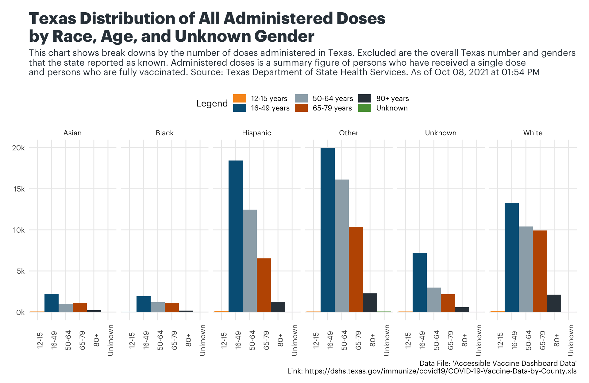
Towards the end of January, the Texas Department of State Health Services (DSHS) began publishing breakdowns of vaccinations by across different demographics, specifically age, gender, and race/ethnicity. While there’s a lot of unknowns in the data–particularly across entries for “Race/Ethnicity”+“Gender”–and also because we don’t have the population estimates for phases 1A and 1B broken down by race/age/gender, the data presented by DSHS struggles to paint an incomplete picture of the profile of vaccinated individuals. That said, the charts below attempt to breakdown that data with as much clarity as possible across all known and unknown classifications.
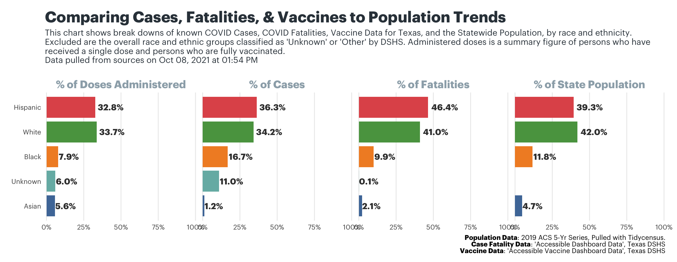
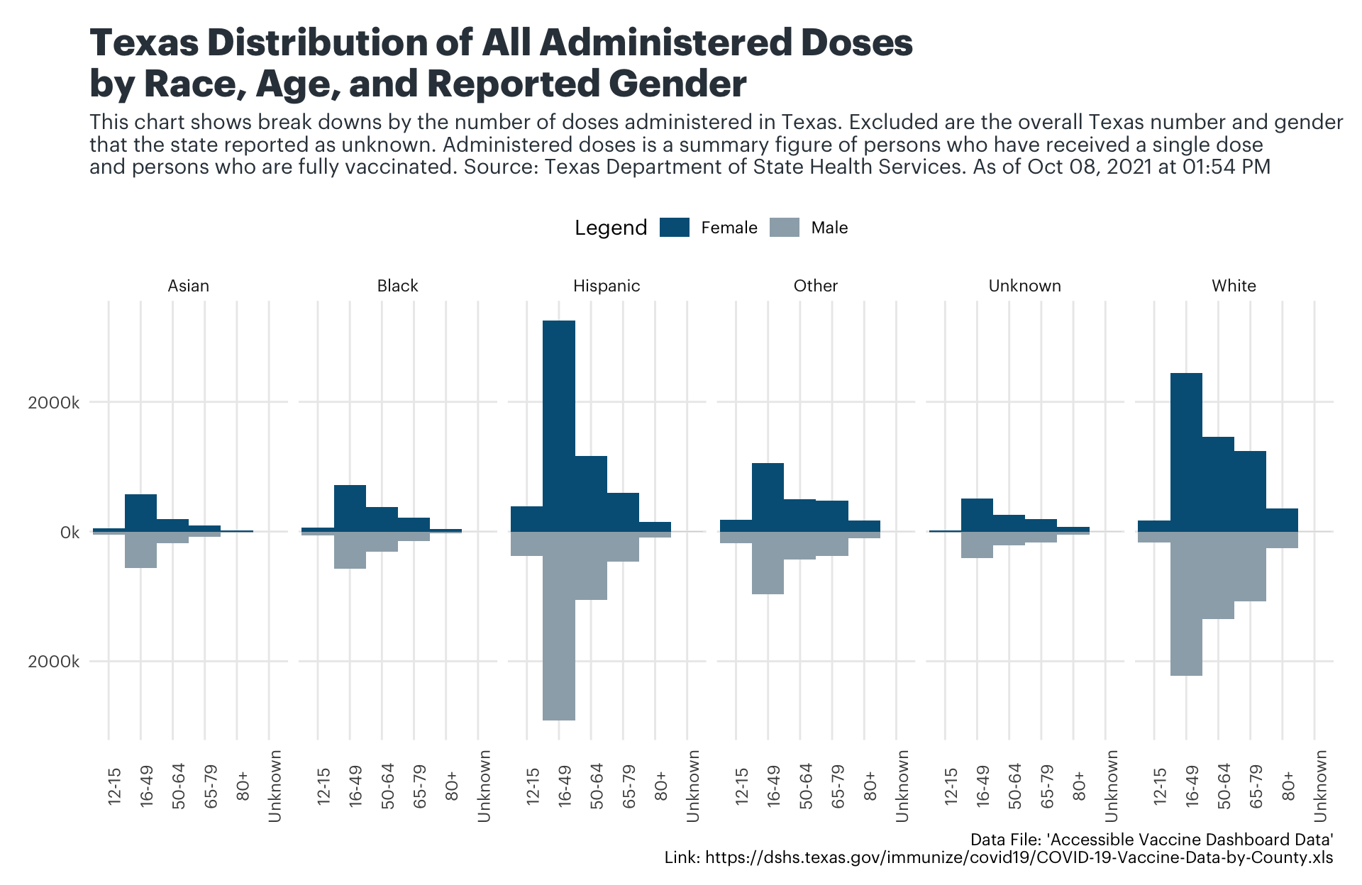
The next chart is broken up into six different panels–one for each classification of a race or ethnicity. Within each of those panels, there’s two sets of five-columned bar charts which represent the reported gender. The dark blue colored bars (facing upwards) represent the female population within each race and ethnicity classification while the gray colored bars (facing downwards) represent the male population within each race and ethnicity classification. Each column within a set of blue or gray colored bars represents a different age group.
Spatial Distributions, by County
One of the datasets that the Texas Department of State Health Services publishes is zip-code level administration data. While seeing the data at a statewide level with zip-codes is helpful, it also compares geographic areas that may have access to different levels of supply. Considering that, we’ve created a resource that allows users to select a county and visualize distribution trends at the county level so that you can spatial trends for zip codes in a county when compared only to other zip codes in a county. Once a user selects a county, the map shows you the rate of doses administered for every 1,000 persons in each zip code.
Vaccines + Access
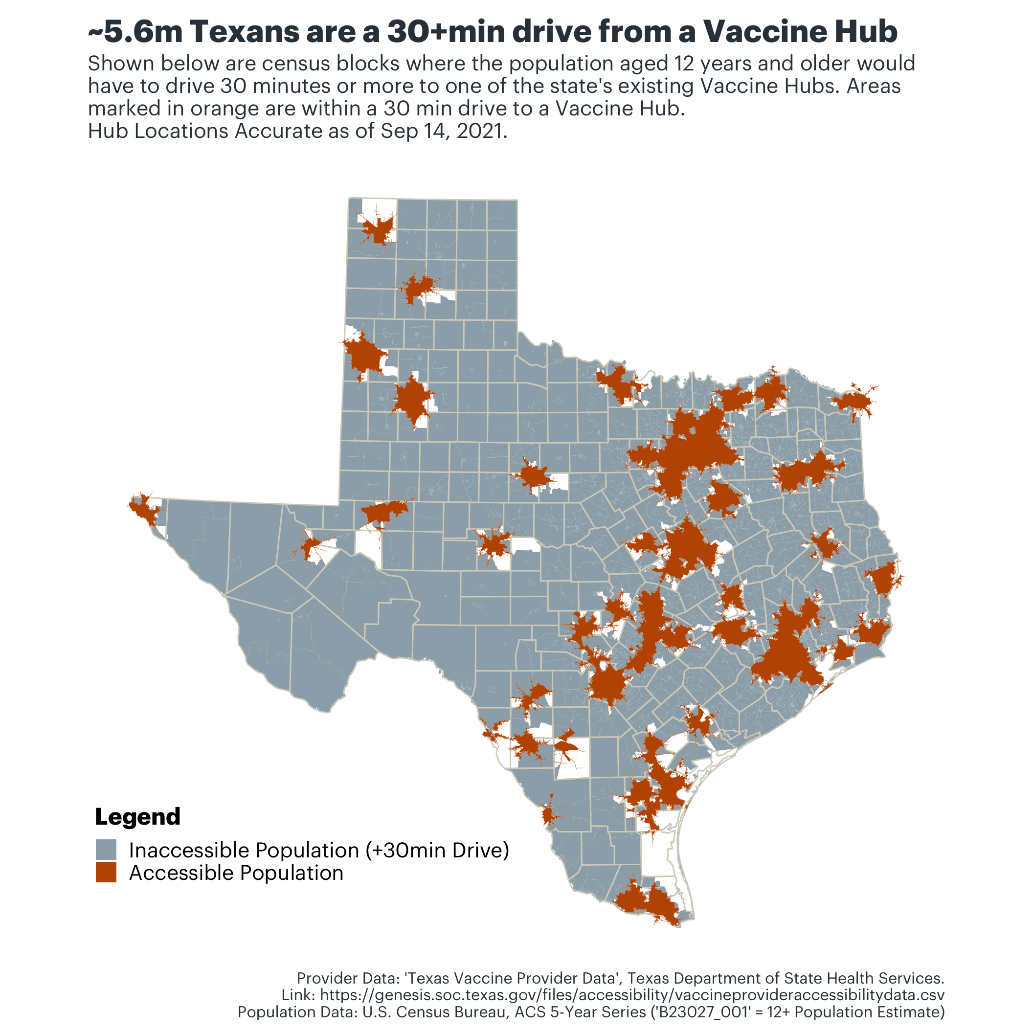
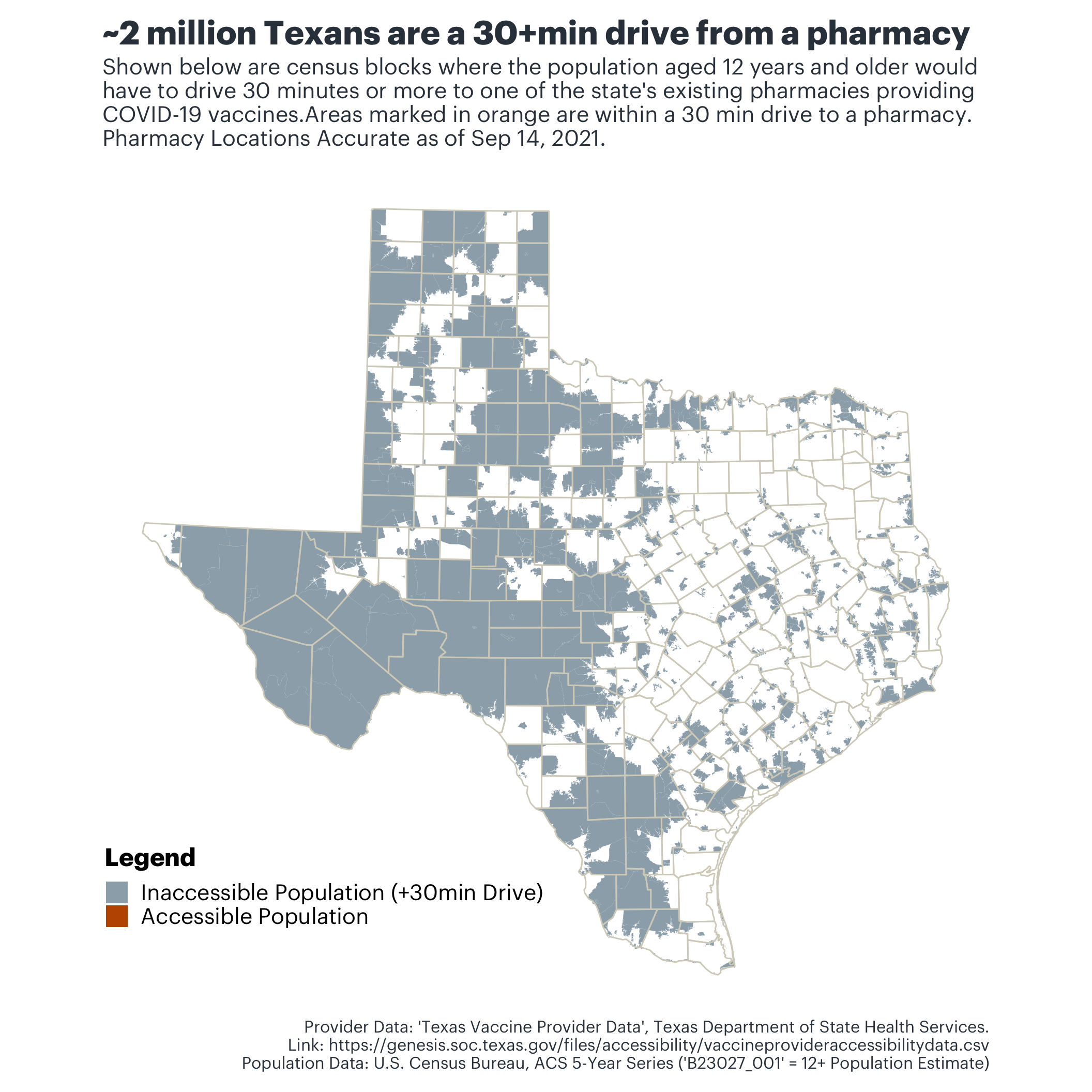
Where Inaccessible Populations Live in Texas
From Vaccine Hubs
From Pharmacies
Photography Credit
Photo by Ryan Magsino on Unsplash